Wednesday, March 31, 2010

Signs of Spring

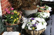
I walked around my yard today and there were signs of spring everywhere. Nature does a wonderful job of decorating our surroundings.


The moss between the flagstones in my patio is even growing. I don't know why, but, I love moss, especially growing in cracks and crevices. A couple of seasons ago I dug up some moss on the side of the house and mixed it up in a blender with some water. (I found the directions online). I then proceeded to "paint" the open areas between the flagstones with the concoction. With all the wet weather we've had my moss is thriving!


Buds on the Viburnum bush


The first bloom on the Viburnum bush


Buds on the Thundercloud Pear Tree


Bud on the Magnolia


This pot sat out all winter. I don't know how the bulbs survived the snow. Hopefully, I'll have some tulips in a few weeks.


The Clematis vine is starting to grow.


Outdoor Fabrics to Transform Your Porch or Patio

Spring is officially here according to the calendar and the weather is slowly catching up. Soon we'll be entertaining outside so I wanted to show you some of the new fabric patterns that are available for use outdoors. Decorating isn't just for the interior anymore. Beautiful decorative fabrics, in an endless array of colors and patterns, made to withstand the elements turn ordinary porches and patios into wonderful outdoor living spaces.


Wednesday, March 10, 2010

Art Museum

Recently The Business Women's Networking group of Newark, DE spent a few hours at the Delaware Art Museum. It's been a while since I've visited a museum so it was very enjoyable, especially the fondue lunch that the Museum provided at the end of our tour.


Thanks to Sue Engler of Engler's Photography for taking the pictures. The Museum didn't allow any flashes so I think Sue did a great job considering the lighting was less than adequate for photography.

Monday, March 1, 2010

Color Predictions for 2010

According to Pantone, turquoise is the Color of the Year for 2010. Of coarse, not everyone will want to use turquoise so here are some other colors to look for that will give your home a fresh new look........


Yellow has been popular for a very long time and will continue to be, but, it will be a little brighter.

As many of my clients know, a true blue has been hard to find over the last few years. That will be changing and blue will be seen more over the next year..


Red, another popular color, will have more purple and blue tones.
Lavenders and purples including eggplant are becoming more popular. In the past they were used as accents and in bathrooms. Now they are being used for bedrooms and are moving into the living areas of the home.
Greens will be more of a leaf green.

In the pattern category geometric patterns have been used a lot in the last few years and will still be seen. Instead of the hard edges usually associated with geometrics the new ones will have softer edges. And, one of my favorites, paisleys are back! Many younger homeowners like traditional looks, but, don't want their home to look old fashioned. This problem is being solved by introducing traditional designs and classic patterns in larger scale. This will make them less formal and give them an updated look.


It takes about twelve months before the full results of a color prediction can be analyzed. Some years the public embraces the new colors and styles and other years the predictions fall short. As a designer I get excited every time a new color or pattern is introduced. Homeowners will have the choice of deciding what colors and patterns they like. The fun part is the anticipation and experimenting with the new.

Don't take color too seriously. Have fun with it, experiment and live with what you love!

Friday, February 26, 2010

Color of the Year


Every year Pantone, the global authority on color, announces the "Color of the Year." They use lots of criteria to make this choice, one of them being the state of the economy. They have chosen turquoise as 2010 Color of the Year. In their press release they said that turquoise "is an inviting, luminous hue that combines the serene qualities of blue and the invigorating aspects of green."


It "evokes thoughts of soothing, tropical water and a languorous, effective escape from the everyday troubles of the world, while at the same time restoring our sense of well being." It seems like the perfect color for us at this point in time.

Colors help change our moods, some favorably and some not so favorably. Turquoise is a color that appeals to both men and women and most people respond favorably. Something that the fashion industry has known for a long time is that the color is universally flattering. It has cool undertones as well as warm undertones which allows it to be used with all the colors in the spectrum.

New colors generally are seen first in the fashion industry and gradually move into home furnishings. So we'll probably see the turquoise in some home decor products in the spring and by fall the collections will expand.

Of coarse, not everyone will want to use turquoise so check back in a few days and I'll tell you what other colors to expect to see this year.

Monday, February 22, 2010

Icicles, One of Nature's Wonders


We create beautiful interior spaces with a lot of planning; but, nothing can compare with the natural occuring beauty of nature.


Arched Windows

Arched windows are beautiful in themselves. Add a special window treatment and they really stand out.


Sunday, February 21, 2010

Follow My Blog

I invite you to become a follower of my blog. By during so you'll be notified whenever I add a post so that you don't miss out on any new information.

Thursday, February 18, 2010

Mirrors

I love mirrors. They can be used to reflect something beautiful, make a room seem larger, or just add a wonderful decorative touch to a room. Small ones can be grouped together on a wall in place of artwork. Also, use smaller ones as trays.


Monday, February 15, 2010

Chocolate

How ironic that the day after Valentine's Day I read a report that says chocolate is actually good for me! It has to do with something called polyphenol flavonoids. I've been telling my husband for years that dark chocolate (my favorite kind) is good for me. His response is that I'm just trying to justify how much chocolate I eat. Now I have proof and I'm certainly going to make sure I show him this report. The same report says that coffee is good for me, too. Yes!!! Two of my favorite things I can now consume with no guilt.

Friday, February 12, 2010

Red Is In The Air


Red is the color associated with Valentine's Day...red hearts, red roses, red wrappings, red dresses and on and on...
Red is a strong color and a little goes a long way. Even though it has been a very popular decorating color for several years, many people use more subtle colors in their homes.
On this special day a little red can add a splash of color and maybe a few sparks to a table for two. HAPPY VALENTINE'S DAY!


Wednesday, February 3, 2010

Snow Days

I got up today to see a decorated landscape. It's ironic that yesterday I sent out my newsletter titled "Don't Use This Color". The color I was referring to is white. Yes, white is beautiful in nature, but, doesn't make much of an impact on interior decor unless you are using a black and white scheme. In Japan white symbolizes death, in eastern cultures it symbolizes coldness and sterility. When everything in nature is covered with snow it looks pure and feels peaceful.
In interior spaces cream and green can create feelings of calm. Some shades of blue are calming also.